Websites that Promote Healthy Lifestyles
How often do you visit a website that’s cluttered and confusing — and more importantly, how long do you stay? Creating a strong focal point and clear visual hierarchy (or order) are keys to a successful web page, every time. When you design a website using visual hierarchy, you create a clear focus. Making information easily accessible for visitors encourages them to spend more time checking out the site.

Veggie Fit Kids
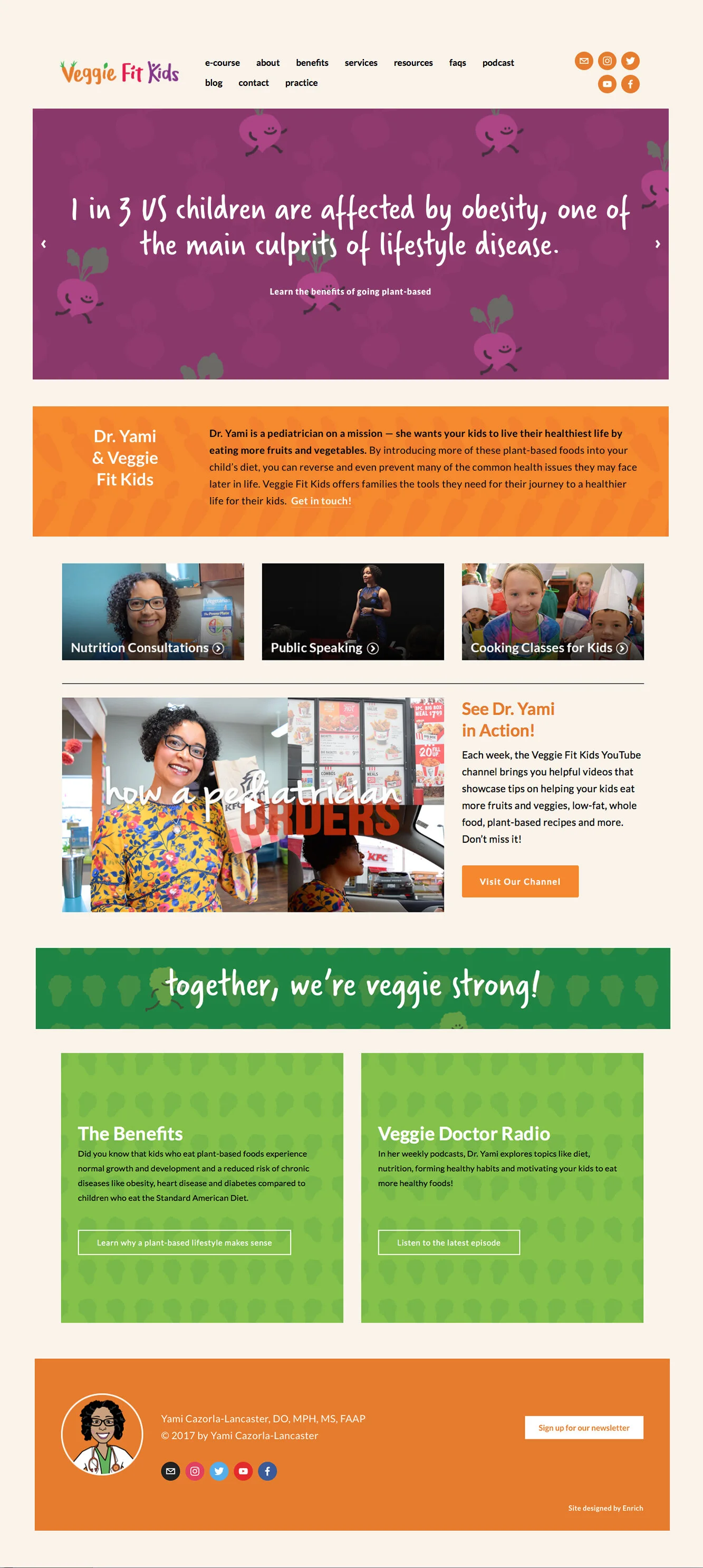
The new Veggie Fit Kids brand and website are ideal examples of design clarity. Dr. Yami Calorza-Lancaster is a plant-based pediatrician in Yakima, WA with a whole-hearted approach to her medical practice and her community. She wants kids to live their healthiest life, and that starts with eating more fruits and veggies. A busy mother herself, she teaches parents and kids that good nutrition and healthy lifestyle habits can prevent and reverse chronic disease, such as childhood obesity and Type 2 diabetes.
While prepping for a TedX talk, Dr. Yami asked for our help in making her offerings more accessible to the community. With podcasts, on-line videos, classes, a blog and her medical micro-practice, this busy pedictrician had alot of info to share.
To help her communicate it all more clearly on her website, we:
Established purposeful visual hierarchy that creates a focal point, without competing messages or clutter;
Made the Benefits, Service and FAQ sections more accessible and easier to follow;
Created calls-to-action and engaging lead-in statements that speak to the parent;
Gave the existing ‘Veggie Fit Kids’ logotype more contrast and life;
Conveyed Dr. Yami’s vibrant attitude and dynamic approach;
Added friendly veggie-people illustrations to draw the viewer in.
Veggie Fit Kids is now a lively brand and website that not only invites families to come in and take a look, but is an extension of Dr. Yami as a whole-hearted doc who is determined for kids to grow up healthy!
Food As Medicine Philadelphia
Setting the stage for your next event begins with defining a theme, securing speakers and planning logistics. But, creating a cohesive brand to package it all is key. Think TEDx. Think SXSW.
For the first-ever Food As Medicine Philadelphia Conference, the speakers alone were enough to create excitement and build anticipation, but the event needed a brand that conveyed this same spirit.
We began by designing an energetic and memorable logo — something that appealed to the conference’s broad audience, which ranges from medical professionals to individuals who are new to everything plant-based. Several variations were created and Dr. Duffy, the conference organizer, selected a strong, colorful mark made of overlapping fruit and veg, accompanied by a medical cross to represent the idea of plant-based food becoming our medicine.
The mark is friendly and easily recognizable across flyers, tickets, giveaways, social media and most importantly, the website.

The website, Foodasmedicinephilly.com was built to share important details about the event, give users a chance to learn more about the speakers and most importantly – register to attend! Strong headlines and clear messaging are helping to quickly spread the word. There’s a buzz (in the Philadelphia community and beyond) about this exciting event that’s about to take place!

Ottawa Lifestyle Medicine
Dr. Jennifer Purdy has just opened the doors to the first-ever Lifestyle Medicine practice in her region of Ottawa, Canada. With a focus on how eating the right foods can heal chronic pain, she is eagerly welcoming patients to her new practice model.

Enrich wanted to create an equally welcoming brand. A logo was the first step in helping Ottawa Lifestyle Medicine stand apart from medical colleagues who practice traditional medicine. The design needed to be clear, powerful and boldly communicate exactly what the practice offers.
Dr. Purdy’s message empowers patients to take ownership of their health and is vibrant, exciting and active. It was important to create a symbol that represents Lifestyle Medicine and also resonates with all ages and stages of health. Several abstract marks with vibrant color and symbols that represent activity and movement were created.

Dr. Purdy chose a bold, colorful mark made of a single apple and stylized person that represents both her practice and approach to helping patients make a commitment to lifestyle change.
A well-organized website with simple navigation makes it easy to learn about Dr. Purdy’s background and her services. Website visitors are able to access important resources and gather more information about programs that Dr. Purdy offers to connect with her community, like Walk with A Doc and Lunch and Learn events.
A strong brand with bold colors, direct messaging and targeted language help this physician accomplish her goals of raising awareness of Lifestyle Medicine, reaching a new audience of patients to build her practice.